


Why Korean Traditional Colors Feel Bold and Calming at the Same Time
First-time visitors to a Korean palace or Buddhist temple often pause beneath the eaves and say something like: "It's so vivid, but it doesn't hurt to look at."
In This Article
First-time visitors to a Korean palace or Buddhist temple often pause beneath the eaves and say something like: "It's so vivid, but it doesn't hurt to look at."
That reaction points to something deliberate. Korean traditional color isn't simply decorative — it operates according to a philosophical system, a set of carefully sourced materials, and a spatial logic that together produce intensity without harshness.
Five Colors That Map the Universe: the Five Directional Colors (오방색, Obangsaek)
The foundation of Korean traditional color is the five directional colors (오방색, obangsaek), derived from the philosophy of yin-yang and five natural forces (음양오행, eumyang-ohaeng). The five colors are yellow (황, hwang), blue-green (청, cheong), white (백, baek), red (적, jeok), and black (흑, heuk) — each corresponding to a cardinal direction: yellow to the center, blue-green to the east, white to the west, red to the south, and black to the north.
The colors carry meaning beyond direction. Blue-green symbolized the generation of all things and was believed to ward off evil spirits and invite good fortune. Yellow, associated with the center of the universe, was considered the most noble of the five and reserved for royalty.
The system doesn't stop at five. Between each primary color, a set of secondary colors called the five intermediate colors (오간색, ogangsaek) were recognized: blue-green mixed with yellow produces green (녹, nok); blue-green with white produces blue-grey (벽, byeok); red with white produces pink-red (홍, hong); black with red produces purple (자, ja). Korean traditional color was not a palette of five isolated tones — it was a structured language with a full spectrum of intermediate values built into its logic.
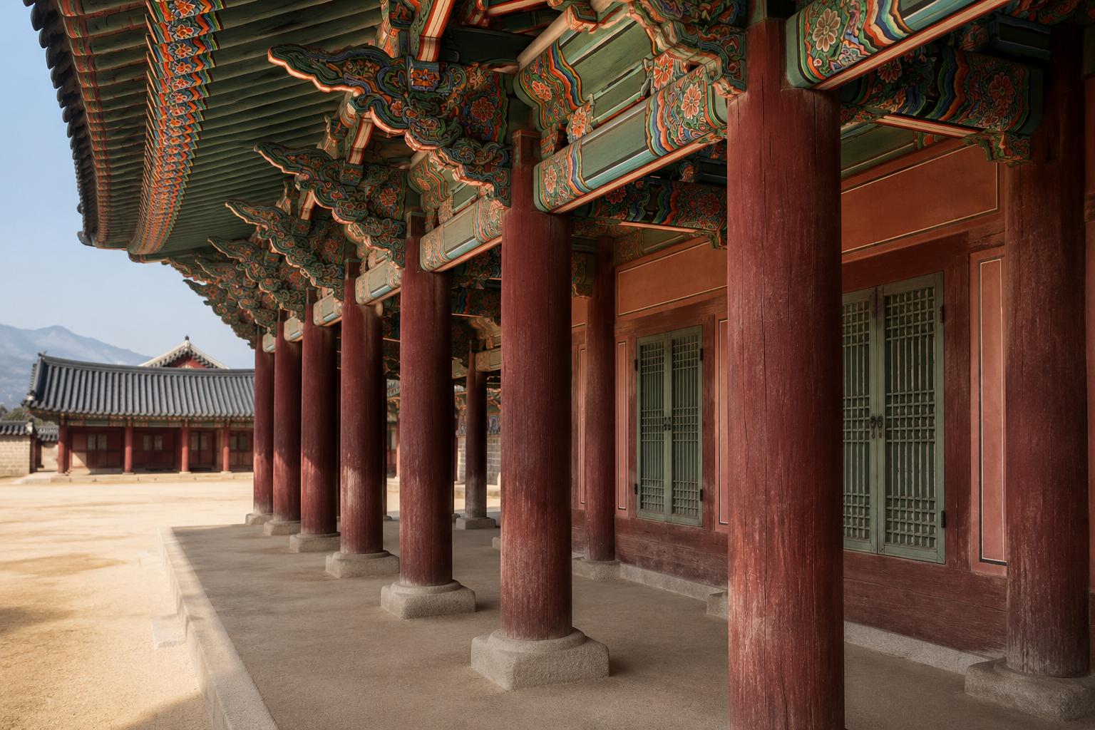
Where Color Became Construction: Traditional Decorative Coloring (단청, Dancheong)
The most concentrated expression of Korean traditional color is traditional decorative coloring (단청, dancheong), the painted ornamentation applied to the wooden surfaces of palaces and temples. Dancheong is often understood purely as visual ornamentation, but it developed from ancient times as an essential technique for extending the lifespan of wooden structures. Applying color was also a form of preservation.
Traditionally, dancheong used inorganic mineral pigments and certain natural organic pigments as its primary materials. A scientific survey by the National Research Institute of Cultural Heritage examined 2,593 pigment samples taken from 44 traditional temples and palaces across Korea, confirming that the raw materials used in traditional dancheong were predominantly natural substances — earth, rock, and minerals.
The pigment names reflect their origins directly. The traditional red pigment red ochre (석간주, seokganju) consists mainly of iron oxides. The green pigment celadonite (뇌록, noerok) is derived from natural weathered rock. The blue pigment azurite (석청, seokcheong) comes from copper-bearing minerals. The white pigment (호분, hobun) is made from ground shell — calcite or aragonite. These are stone and mineral in powder form. Pigments made this way absorb light rather than reflect it artificially, which is why high-saturation colors in dancheong read as rich rather than sharp.
Access to dancheong was historically restricted. In 1429, King Sejong issued an order prohibiting the use of red lacquer paint on ordinary residential buildings. Over time, dancheong was limited to government offices, Buddhist temples, and specific shrines. The visual intensity was deliberately concentrated in sacred and official spaces — which gave those spaces a distinct weight that ordinary surroundings did not carry.
The Role of Emptiness
The third element in this equation is the space around the color. Dancheong's reds, greens, and blues do not appear in isolation — they are always set against unpainted wooden columns, bare earth walls, and open courtyards. The contrast between saturated color and neutral ground is not incidental; it is structural.
This is how Korean traditional aesthetics manage intensity: not by reducing it, but by controlling the context around it. The color reads as bold because the surrounding space offers no competition. It reads as calm because it is never crowded. The palette and the architecture work as a system, not as separate decisions.